Work Korea

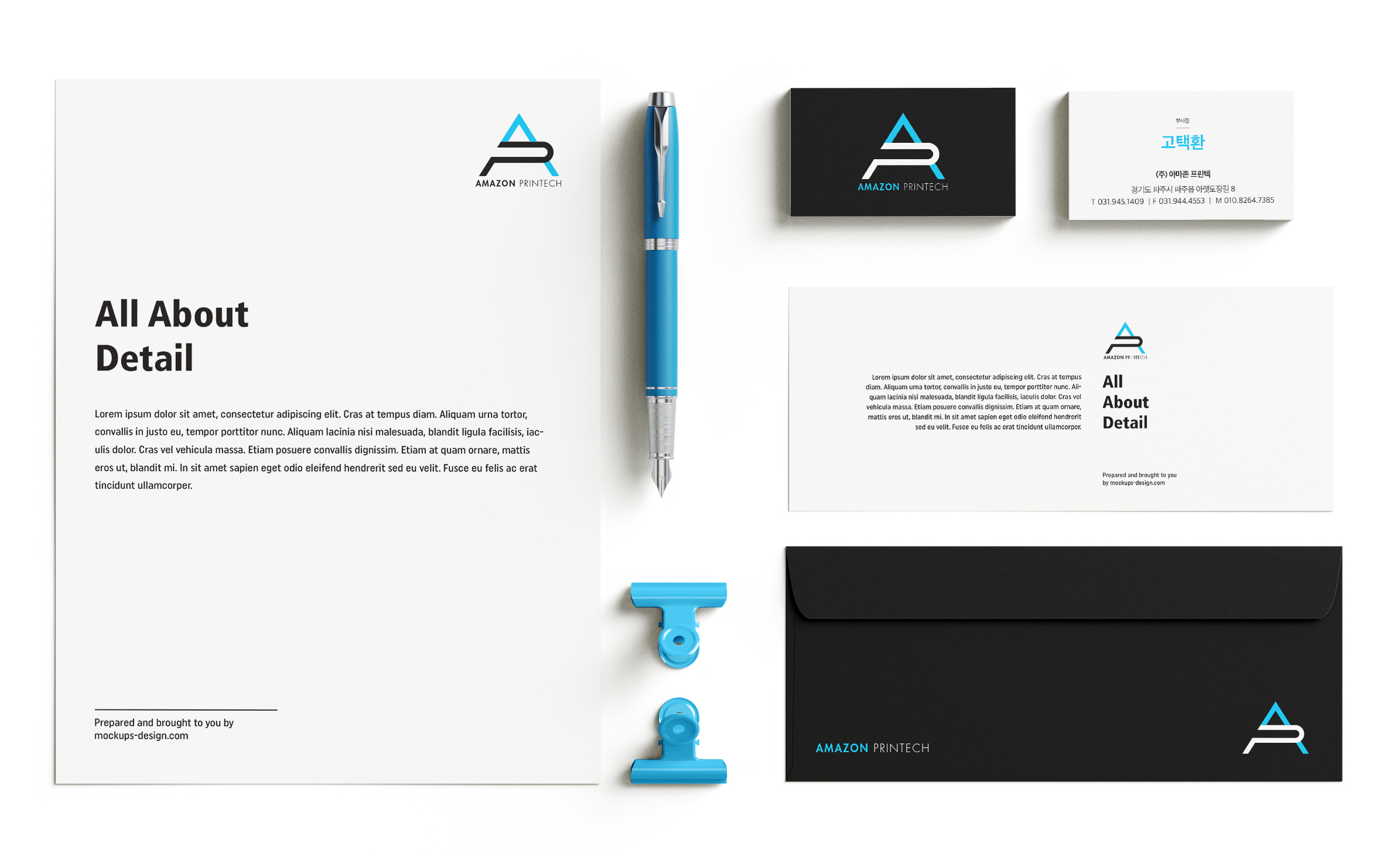
Amazon Printech _ Brand Identity
Amazon Printech is a Printing Press company in Korea. Their new brand logo features a modern, strong geometric sans-serif typeface in acronymic form. Using a contrasting color palette gives a bright and trustworthy image to clients.
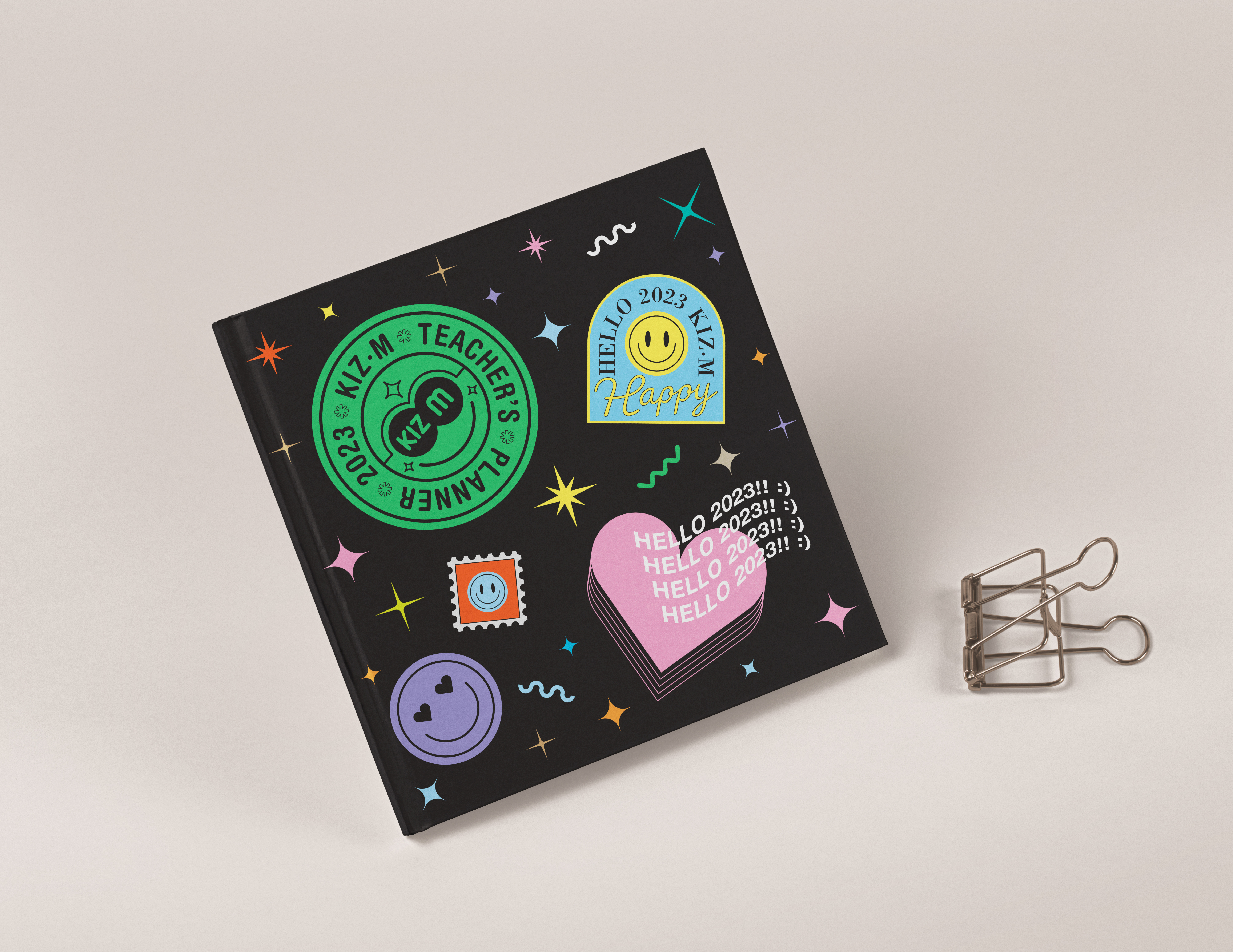
2023 Kizm Diary _ Diary Design
The 2023 Kizm Diary is targeted at Kizm kindergarten teachers. The most significant focal point of the graphic concept is showing positive feelings and excitement for the coming new year. It can give hope that it will be a new chapter in a better way for every part of the education business sector.
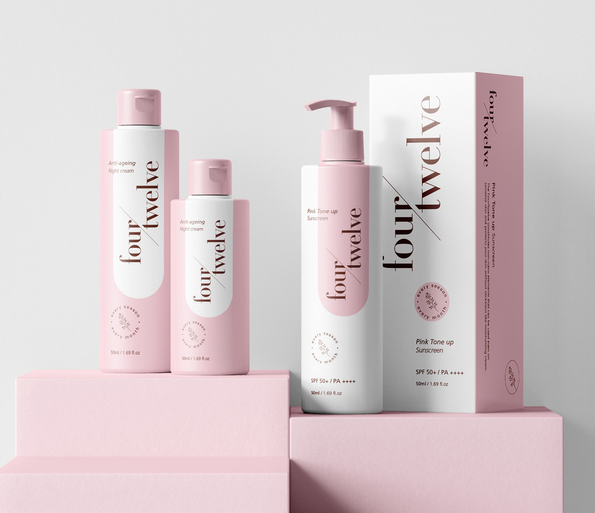
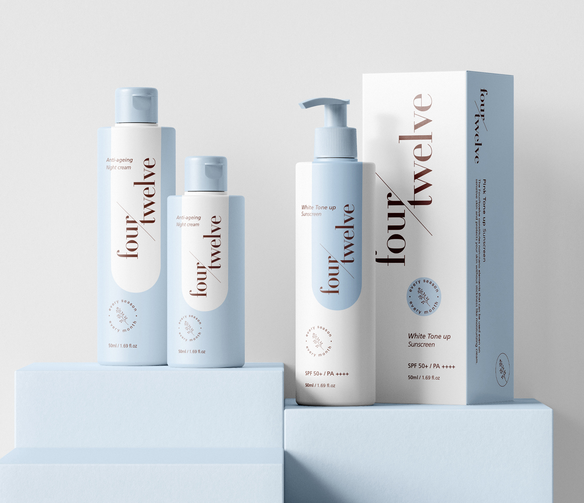
four/twelve _ Brand & Packaging Design
The brand name stands for four seasons, twelve months, which means people can use every season, every month. New Korean cosmetic Brand Identity is designed a clean, type-based logo and brand package.
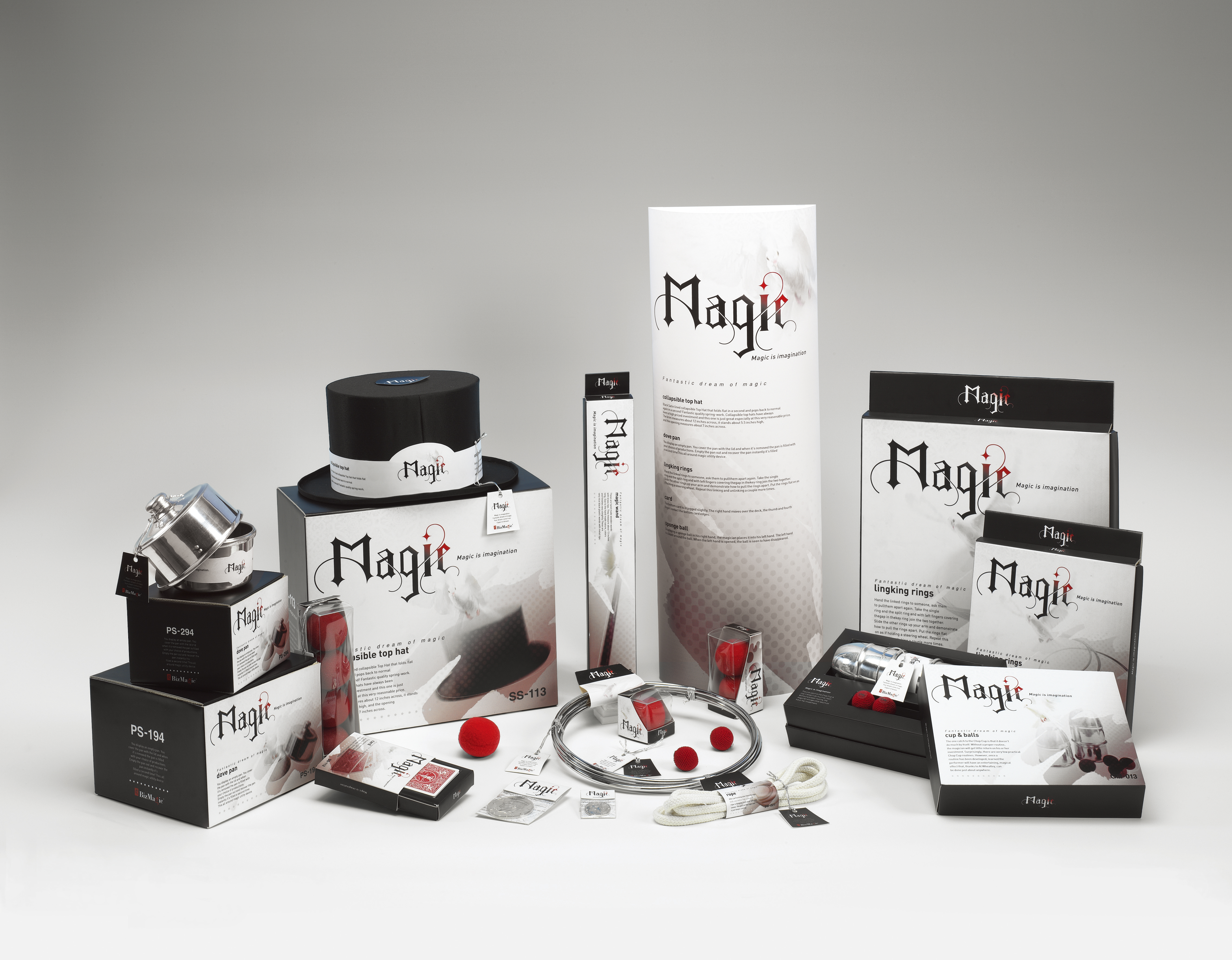
Magic _ Packaging Design
Magic is a package design for professional illusionists. This is one of my thesis projects in my univercity in Korea. This was awarded at the Korea Industrial Design Award 2004.
English Crayon _ Kids English Program
English Crayon is an English education monthly program for children. Children learn English through reading and playing, and main characters were designed with the concept of crayon shape.
Honeybook _ Brand Identity
Honey Book(Kulcheck) is the name of a children's reading education program. The character was developed with the image of honeybees for children. The logo was designed that the honeybees and honey image embody the word.